
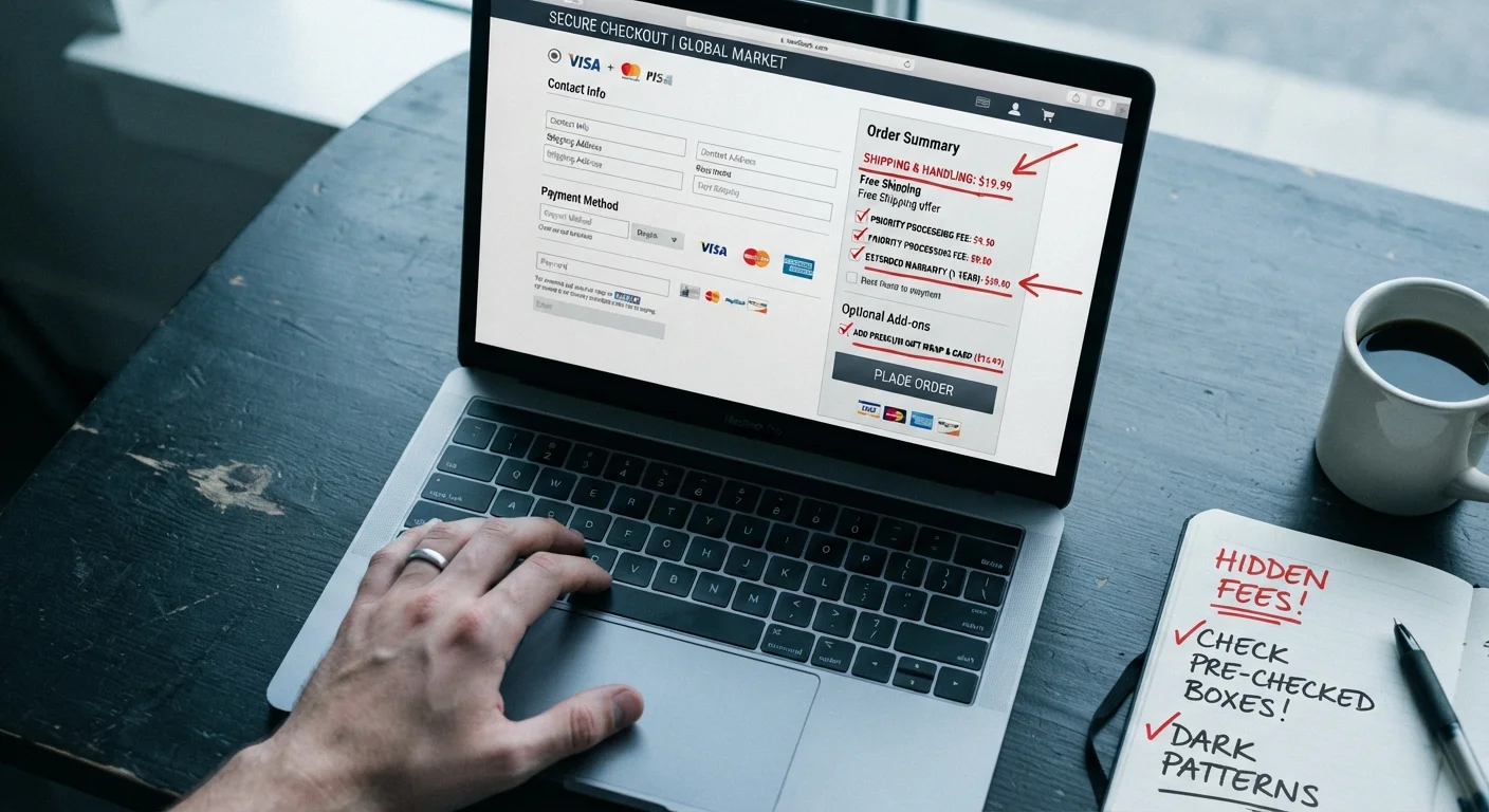
What Are Dark Patterns?
Dark patterns are user interface design choices that deliberately steer shoppers into actions that benefit the retailer at the shopper's expense — think unwanted subscriptions, inflated totals, and confusing cancellation flows. The term was coined by UX researcher Harry Brignull and has since been documented by consumer protection agencies including the Federal Trade Commission (FTC).
| Regulatory attention | FTC has issued enforcement guidance on dark patterns in e-commerce (FTC Report on Dark Patterns, 2022) |
| Common locations | Cart page, checkout flow, account sign-up, free trial enrollment |
| Primary consumer harm | Unwanted charges, unauthorized subscriptions, inflated order totals |
| Most exploited behavior | Shoppers rarely scroll past the total before confirming an order (Consumer psychology research on checkout friction) |
| Most common pattern type | Pre-checked opt-ins and hidden fees |
These tactics aren't glitches or oversights. They're intentional design decisions built into checkout flows, confirmation screens, and account pages. Recognizing them is the first step to neutralizing them. For a broader look at deceptive retail behavior, see what's buried in retailer fine print.
The Most Common Dark Patterns at Checkout
These are the patterns you're most likely to encounter — and what to do about each one.
Pre-Checked Boxes
A box arrives already ticked, opting you into a newsletter, a paid loyalty program, or purchase protection. Retailers know most people never uncheck defaults. Fix: Scroll every checkout page before clicking "Place Order" and uncheck anything you didn't deliberately select.
Hidden or Drip Fees
The advertised price omits processing fees, service charges, or shipping costs until the final confirmation step. Research from consumer advocacy groups consistently finds that surprise fees are a leading source of checkout abandonment complaints. Fix: Treat every price you see before the final summary screen as a floor, not a ceiling.
Confirm-Shaming
Decline buttons are written to make you feel foolish — "No thanks, I don't want to save money" instead of a neutral "No thanks." This is emotional manipulation dressed as copy. Fix: Read the action you're actually taking, not the framing around it.
Disguised Ads
Sponsored listings styled to look identical to organic search results or product recommendations. Fix: Look for small "Sponsored" or "Ad" labels, often in light gray text near the top of results.
Forced Continuity
A "free trial" requires a credit card and auto-converts to a paid subscription with little warning. Fix: Before entering payment info for any trial, locate the cancellation policy. If it isn't clearly stated, that's a red flag — see more red flags that signal a deceptive offer.
Misdirection and Visual Tricks
The "Continue" button is large and brightly colored; the "Remove" or "Decline" link is tiny, gray, and placed far from the main flow. Fix: Before confirming any order, verify every line item in your cart — not just the total.
Dark Pattern
A design choice in a website or app that manipulates users into unintended actions, typically benefiting the company at the user's expense. The tactic exploits cognitive shortcuts and visual hierarchy.
Forced Continuity
A billing practice where a free trial automatically converts to a paid subscription unless actively cancelled. Users often discover the charge only after it appears on a statement.
Drip Pricing
A pricing strategy where mandatory fees are revealed progressively during checkout rather than upfront, making the initial price appear lower than what the consumer actually pays.
Confirm-Shaming
A copywriting tactic that phrases the opt-out or decline option in guilt-inducing or self-deprecating language to discourage users from selecting it.
Pre-Checked Default
A checkbox or option that arrives already selected, requiring the user to actively opt out. Retailers use this to increase sign-ups for add-ons, subscriptions, or data sharing.
Building a Checkout Habit That Protects You
Awareness alone isn't enough — you need a repeatable routine. Here's a practical checklist to run through before every online purchase:
- Review the full cart — verify quantities and remove anything you didn't add intentionally.
- Check every checkbox — default-on selections for add-ons, insurance, or memberships should be actively evaluated.
- Compare advertised vs. final price — note any fees added between the product page and order summary.
- Read the subscription language — if the word "recurring" or "renews" appears, confirm you want that commitment.
- Screenshot your order summary — this creates a timestamp record if a dispute arises later.
Pairing these habits with a structured pre-purchase evaluation helps. Our pre-purchase checklist walks through need, price fairness, and post-purchase considerations in one place.
Dark patterns also contribute to a broader problem of systematic overpaying. Where shoppers consistently overpay explains the categories and contexts where this happens most.